This wasn’t really about building a website. It was about translating a way of seeing into something you can scroll through without breaking it.
Jason Bergh doesn’t think in pages, menus, or structured user flows. His work lives in scenes, in rhythm, in tension and release. So from the very beginning, the idea of creating a conventional portfolio felt slightly misplaced — like trying to frame something cinematic inside a static grid.
What we were aiming for instead wasn’t a better website. It was something closer to presence.
A Director, Not a Website Owner
Jason already had a website, and technically, it did everything it was supposed to do. It presented projects, gave context, and followed familiar patterns. But it didn’t quite reflect the way he sees and constructs his work.
And that became the real starting point.
Because when your medium is emotion and pacing, a traditional interface can easily become noise. Too many signals, too many instructions, too many layers explaining themselves. The more we looked at it, the clearer it became that improving the existing structure wouldn’t solve the problem.
“We had to step away from the idea of structure altogether and rethink what a digital presence for a director could feel like.”
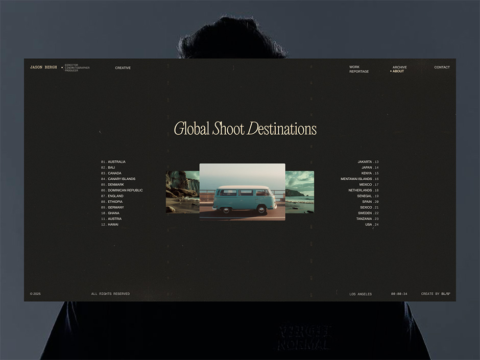
Killing the Interface
Most websites are built to guide, inform, and direct attention as clearly as possible. Here, we were more interested in what happens when you remove that layer almost entirely.
Instead of adding features or refining navigation, we started subtracting. Menus became less visible, then unnecessary. Interface elements that explained how to use the site slowly disappeared. What remained was something much quieter, but also more intentional.
The idea was not to make things minimal for the sake of aesthetics, but to create space for the work to exist without interruption. When there’s less to process, there’s more room to feel.
At some point, it stopped feeling like an interface you operate and started behaving more like an environment you enter.
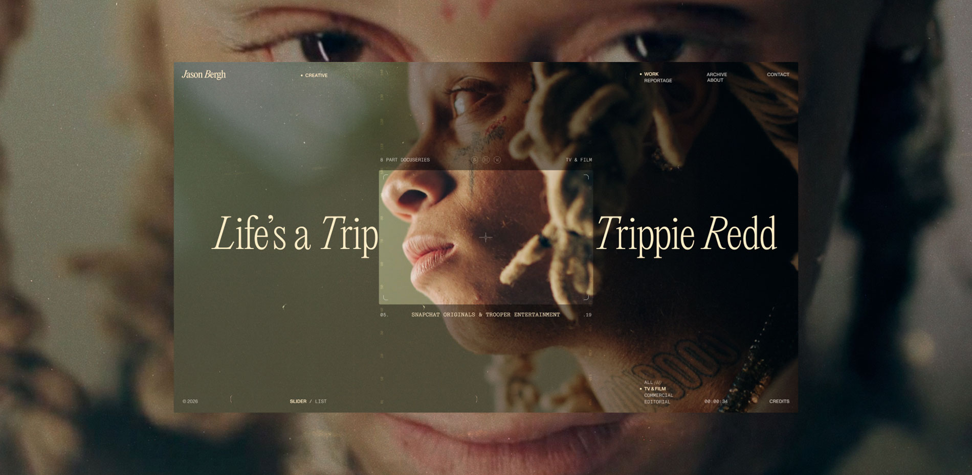
Rhythm, Not Navigation
A key shift in the process was moving away from navigation as a concept and thinking instead in terms of rhythm.
For a director, timing is everything. The way something appears, how long it stays, and when it disappears carries meaning. We tried to bring that same logic into the digital experience, where scrolling becomes less about moving through content and more about progressing through a sequence.
Transitions were treated like cuts. Pauses were deliberate, not accidental. Nothing needed to rush, and nothing needed to over-explain itself. The experience unfolds gradually, allowing the viewer to stay with it rather than constantly making decisions.
In that sense, it feels closer to watching than browsing — and that subtle shift defines the entire project.
Motion as Narrative
Animation played a central role, but never as decoration. Every movement had to justify its existence.
We approached motion the same way editing is approached in film: when it works, you don’t notice it, but you feel its impact. When it doesn’t, it becomes distracting immediately. That meant constantly questioning whether something was helping the narrative or simply adding noise.
Over time, motion stopped being a layer on top of the interface and became the interface itself. It guides attention, sets pace, and creates continuity without relying on explicit instructions.
“The result is a system where movement doesn’t explain the experience — it carries it.”
Less Control, More Trust
One of the more uncomfortable aspects of the project was letting go of control.
In digital design, there’s a strong tendency to anticipate every user action and provide clear options at all times. Here, we intentionally moved in the opposite direction. Fewer choices, fewer visible controls, fewer explicit paths.
This required a certain level of trust — not just in the design, but in the audience. Trust that people don’t always need everything explained, and that they can navigate based on intuition and curiosity.
It also meant accepting that the experience wouldn’t be for everyone, which, in this case, felt like the right trade-off. The goal wasn’t to optimize for efficiency, but to stay true to the tone of the work.
Building the Experience
From a technical perspective, the challenge was making something restrained feel precise and alive at the same time.
With very little interface to rely on, details like timing, smoothness, and responsiveness became critical. Even small inconsistencies would immediately break the illusion, so a lot of effort went into refining how everything behaves rather than how much it does.
Animation frameworks were used to control sequences and transitions with a high level of accuracy, ensuring that every interaction feels intentional. Performance was treated as part of the design itself — not something to fix later, but something that shapes the experience from the start.
The overall approach stayed consistent: avoid unnecessary complexity, but maintain full control over what remains.
What We Learned
One of the clearest takeaways from the project is that removing elements is often more demanding than adding them.
Every decision carries more weight when there are fewer components to support it. There’s no extra interface to compensate for something that doesn’t work, which forces a higher level of precision in both design and execution.
We also realized that clarity doesn’t always come from explanation. In many cases, it comes from consistency, pacing, and restraint — from creating an experience that feels coherent rather than explicitly guided.
“And perhaps most importantly, not every digital project needs to solve a problem in the traditional sense. Some are meant to create a specific feeling and hold it long enough for it to resonate.”
Outcome
The final result doesn’t try to impress immediately or compete for attention in an obvious way. Instead, it builds gradually, allowing the viewer to settle into its pace.
It doesn’t behave like a typical portfolio, and it doesn’t try to. Rather than presenting information as efficiently as possible, it focuses on creating a consistent atmosphere that reflects the way the work itself is experienced.
People don’t just visit it and leave. They spend time with it, which, in this context, feels like the most meaningful outcome.
Technologies
Frontend Frameworks and Libraries JavaScript, GSAP for animation control and sequencing
Backend Technologies Lightweight setup focused on performance and content delivery
Server Architecture Optimized hosting environment with emphasis on fast load times and smooth rendering
Tools Figma, motion studies, performance optimization tools, video processing workflows
Company Info
Welcome to BL/S® — a boutique creative studio where luxury meets rebellion. We specialize in crafting award-winning web experiences for brands that refuse to blend in.
We don't do "templates." We do digital excellence that wins SOTY at Orpetron, bags Lovie Awards, and gets nominated for Site of the Year on Awwwards. Our work is a mix of striking visuals, custom GSAP animations, and the kind of "wow" factor that stays with you.
W: https://blacklead.studio/ IG: https://www.instagram.com/blacklead.studio/ X: https://x.com/blackleadStudio