A Place to Call Home
For a long time, we simply wanted to build something that felt like a home rather than just another portfolio. As a studio, your website is often your only truly free space, a digital flagship. Yet, so many sites we see within our industry feel like they could move away from being cold, sterile galleries. We wanted sanrita.ca to be a real territory, a place that captures both the technical precision of our craft and our deep-rooted love for the outdoors.
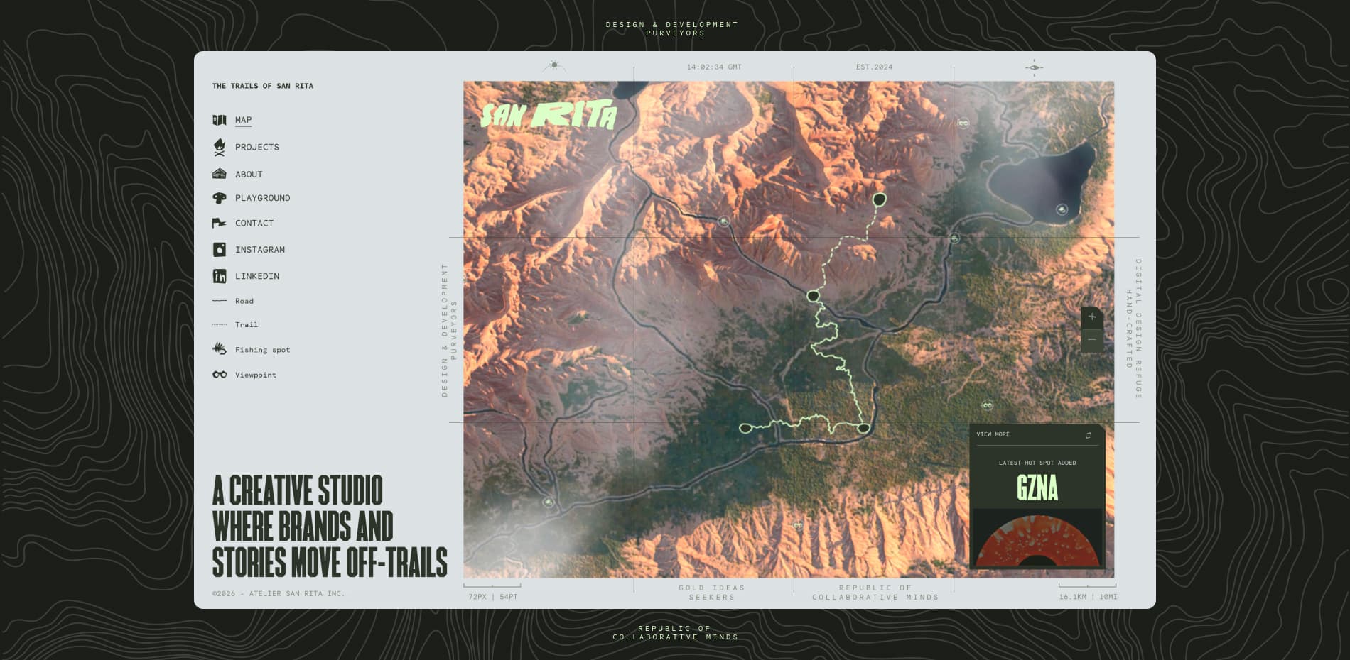
Our journey started with a simple but persistent obsession: how do we take the tactile, nostalgic charm of vintage National Park maps and turn them into a living 3D experience? We didn't want to just list our services or showcase a grid of thumbnails; we wanted to invite people to step off the beaten path and explore a landscape that felt as organic as the physical world.
The Spark: Rejecting the "Default" Web
The project began as a reaction to the standardization of the web. We noticed that digital experiences were becoming increasingly predictable, perfectly clean, perfectly white, and often perfectly boring. As a team based in Montréal, we are constantly inspired by the contrast between the city’s creative grit and the vast, raw wilderness just a few hours away. We wanted our site to embody that contrast.
We spent months defining what "Digital Craft" meant to us. It wasn't about using the newest tech just because it was available; it was about using code as a tool for storytelling. We looked at old topographic maps from the 1950s, the kind with sun-faded colors, grainy textures, and hand-drawn elevations. There was a soul in those maps that we felt was missing from modern UI design. That became our North Star.
Building the Territory: From GPS to Shaders
The heart of the site is an interactive 3D map that serves as our main navigation. It’s a narrative bridge between the two places that define us: the warm, easy-going vibes of California and the raw, wild landscapes of Canada.
To make this map feel authentic, we didn't just "draw" a 3D model. We treated the site like a topography project. We pulled real GPS data and heightmaps to generate the initial terrain. Using Blender, we sculpted these elevations into a bespoke digital landscape that felt intentional. But bringing that into a web browser was a massive challenge.
In the early stages, the site was heavy. Our high-poly models were beautiful, but they crashed mobile browsers instantly. We had to learn the art of "killing our darlings." We moved to a workflow where we baked all the intricate details from our high-resolution sculpts onto much lighter, low-poly meshes using Adobe Substance 3D Painter. This allowed us to keep the rocky ridges and deep valleys visually sharp while keeping the file size small enough to load in seconds.
The "paper" feel was another obsession. We didn't want a shiny, plastic 3D look. We spent weeks writing custom GLSL shaders to inject noise and grain directly into the materials. We wanted the light to hit the "paper" and reveal a texture that felt like you could reach out and touch it. It was about making the digital feel tactile.
The Flow: Navigating with Intuition
Beyond the map, we wanted the act of browsing our work to feel like a journey. We’ve always been frustrated by 3D sites where the navigation feels like a gimmick, where you’re fighting the camera just to find a link. Our goal was for the technology to disappear behind the experience.
For the projects page, we developed an infinite scroll system that feels like trekking through a grid of memories. This required a complex orchestration of two distinct systems. We have a persistent 3D world running in the background, powered by React Three Fiber, while a smooth, high-performance HTML layer handles the typography and UI.
Managing the "nested scrolling", where you are scrolling through a list while the 3D world responds in real-time, was one of our biggest technical hurdles. We used Lenis for smooth scrolling and GSAP to link the scroll position to the camera’s movement. We spent days fine-tuning the "weight" of the scroll. It couldn't be too fast, or it would lose its cinematic feel; it couldn't be too slow, or it would feel sluggish. We wanted it to feel like you were gliding over the terrain.
The Performance Tug-of-War
As designers, we want everything to be beautiful. As developers, we want everything to be fast. This project was a year-long tug-of-war between those two desires.
One of the turning points was our decision to use a "global" canvas. In many Three.js sites, the 3D scene unmounts and remounts as you navigate pages, causing "jank" or loading screens. We kept our canvas mounted outside the main App Router in Next.js. This means the terrain never disappears. When you click on a project, the camera simply dives into a specific coordinate on the map. It’s one continuous shot, which adds a level of immersion that a standard page transition just can't match.
We also had to become obsessed with optimization. We used Draco compression for our 3D assets and KTX2 for our textures, which are much more efficient for GPUs to handle than standard JPEGs. We even implemented an adaptive quality system: if the engine detects that the frame rate is dropping, it subtly reduces the resolution of the shadows or the density of the grain to keep the movement fluid. We believe that a "Wild Soul" shouldn't mean a broken experience.
Lessons from the Trail
Looking back, building San Rita taught us a lot about restraint. There were dozens of features we built and then deleted because they felt like "too much." We had a version with birds flying over the map, interactive weather, and complex day-night cycles. In the end, we realized those things were distracting from the core story.
The beauty of the project lies in its simplicity and its focus on the "feel." We learned that the most powerful digital experiences aren't the ones with the most features, but the ones with the most cohesive atmosphere. We wanted the user to leave the site not just remembering our projects, but remembering how it felt to spend time in our world.
The site is also a testament to the power of a small, dedicated team. Because we aren't a massive agency, we could afford to be experimental. We could spend an entire afternoon arguing over the exact shade of "National Park Green" or the intensity of a grainy overlay. That level of care is what we mean by "Digital Craft." It’s the digital equivalent of a carpenter obsessing over the grain of a piece of wood.
A Living Portfolio
San Rita is an ever-evolving product: it’s a living territory. We’ve already started thinking about "Version 2," where we want to bridge our headless CMS, DatoCMS, even more deeply with the 3D environment. Imagine a world where every new project we add automatically creates a new landmark on the map, allowing our digital home to grow as we do.
In an era where AI can generate a standard layout in seconds, we believe that human intuition and "imperfect" design are more valuable than ever. sanrita.ca is our way of stepping off the beaten path. It’s an invitation to explore the intersection of our technical grit and our creative gut.
About the Studio
Atelier San Rita is a Montréal-based design studio led by Julien Sister, Alexis Malin and Martin Thienpont. We specialize in branding, art direction, and high-performance digital experiences. We help brands map out their own unique territories by blending deep technical mastery with a raw, creative soul. Our work is a reflection of who we are: explorers at heart, and craftsmen by trade.